The new face of Poznan Science and Technology Park
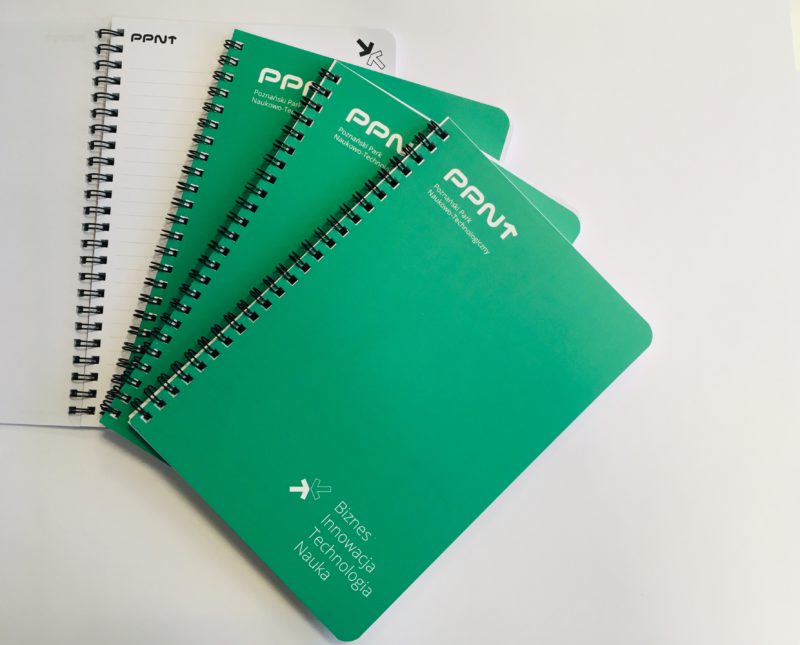
2019-03-21 The first day of spring 2019 was very refreshing to us. We designed not olny a new logo, but a whole new visual identity of PPNT. Our aim is to show that we are reliable, dynamic, and open-minded.
With our new logo we want to emphasise:
- PSTP’s dynamic growth and the need to constantly develop new solutions (that is why we use an arrow instead of a “T” letter);
- flexibility and creativity (reflected in smooth, rounded font);
- reliability, experience, and expertise (classic, black font);
- distinctness and character (thick, distinct line).
An arrow representing the “T” letter points to the opportunities that PSTP gives to their clients. It symbolises growth, development, and acceleration. The new PSTP logo is simple, minimalistic, based on the Polish abbreviated name of the Park (PPNT), and its typography. It corresponds well to PSTP’s visual identity which is now more vivid and colourful. Our new leading colour is green – the symbol of growth, openness, energy, and freshness.
The message we send to our clients and partners should be clear. Poznan Science and Technology Park means:
- Business – we support companies at every stage of development; we create solutions and technologies tailored to the client’s needs; we offer professional advisory services, development funds, and international business networking opportunities;
- Innovation – we create and help to protect inventions; we guide companies and researchers through commercialisation and other processes related to obtaining patents, intellectual property protection, and implementation of innovations;
- Technology – we create solutions aiming to support businesses; we create new technologies and provide access to state-of-the-art laboratories;
- Science – we do research; we work on assignments from our clients; we support researchers in obtaining funding and carrying out their own research.
We offer our services to every ambitious entrepreneur who wants to be innovative and future-oriented. We are creative and open to cooperation. Our new logo and visual identity show it very clearly.
It all started with research
PPNT combines research and business. It bridges the gap between these two worlds so that they can mutually benefit from each other. Our roots are in science. We are a research centre and we know how to implement research outcomes in business. We support businesses, entrepreneurs, and innovators in the process of implementing their ideas and solutions.
We are based in Poznań and we have been operating here for the last 25 years. However, we work not only in Wielkopolska, but also in other regions in Poland and abroad. That is why we are fully aware of the fact that researchers’ job and companies’ expectations are constantly changing. We are flexible, we grow rapidly, trying to face these challenges.
That is why we have modified our visual identity. We have changed our logo and other elements of our brand image to show our identity and values, such as innovation, creativity, and cooperation.
– We want to emphasise that our extensive experience is our advantage in the market; that it means expertise, reliability in offering services, and our need to constantly develop new solutions – says Justyna Cięgotura, Deputy Director of PPNT.
We unify our message but we do not lose diversity
PPNT becomes an umbrella brand – this is how we want to be perceived, this is our main message. With our new logo we combine several fields and activities.
– For more than 20 years we have been doing research in the field of chemistry and biotechnology, offering advisory services and support in obtaining EU funding and research grants. At PSTP there is one of the best Regional Points of Contact for EU Framework Programmes in Poland, and a state-of-the-art DataCenter. For the last 5 years we have been running the Imagine Lab, a PSTP research centre – says Prof. Jacek Guliński, Director of Poznan Science and Technology Park.
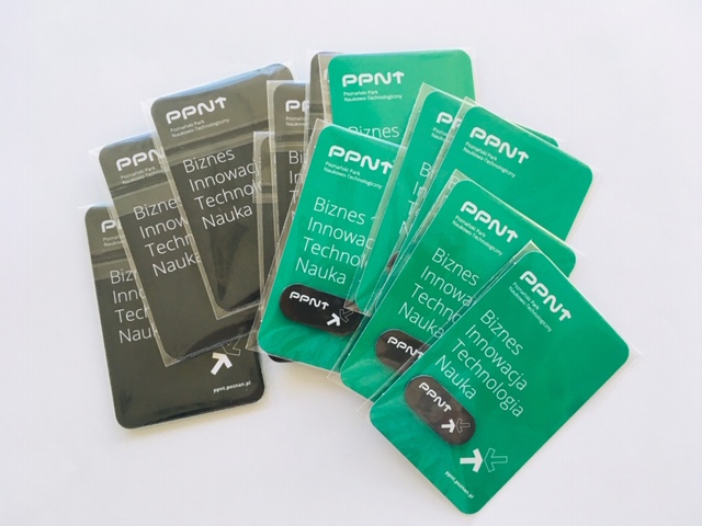
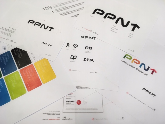
We want our message to be clear and coherent: PSTP cooperates with other units to the benefit of our clients. We are united and we communicate with one another. That is why we have created our new visual identity. It will be visible in our logos (Imagine Lab, the “Parkowe Skrzaty” kindergarten etc.), letter sheets, presentation drafts, business cards, etc.
In general, PSTP uses subdued colours but we have now added vivid green elements. In this way, we managed to keep the balance between scientific (technical) tidiness (icons, technical descriptions) and more emotional language and a friendly atmosphere associated with our flexibility and business relationships.
– Our visual identity with its simple logo provides a framework for different business activities of the Park. And although our new leading colour is green, we will also use combinations of other colours. In this way we will be able to show our diversity and flexibility – says Ewa Kocińska-Lange, Deputy Director of Poznan Science and Technology Park.


